Charts
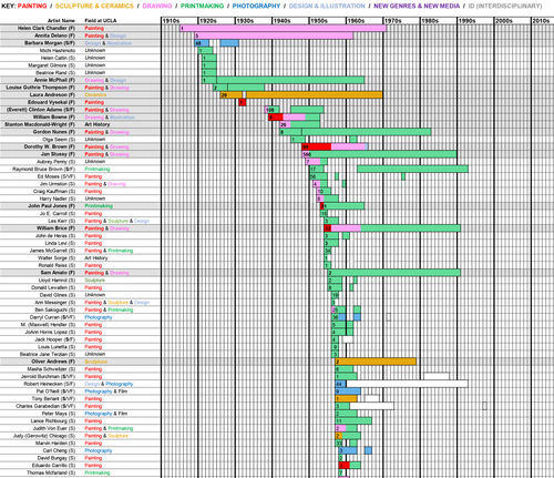
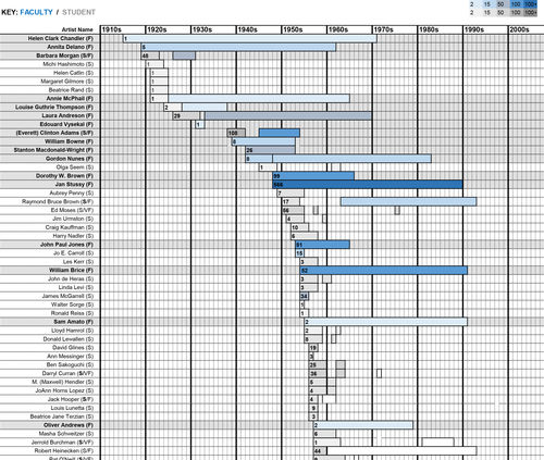
Project researcher Claire de Dobay Rifelj created these visualizations using the data our team compiled on UCLA artists in the Hammer Museum collections. They provide at-a-glance graphic representations of the artists and their work that would be difficult to communicate otherwise. Both charts show the status of the artist—student or faculty—as well as the length of the tenure at UCLA. The first chart is color-coded to represent the department and/or media in which each artist worked or taught; the second is color-coded to represent the number of works by each artist in the Hammer Museum's collection. Download them both to explore further.


