Process
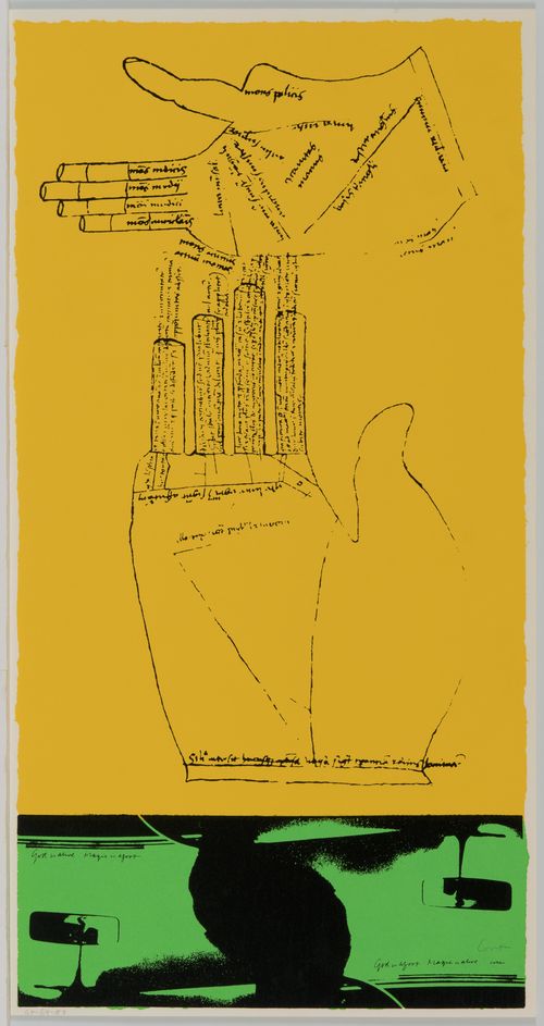
Corita Kent likened her creative process to cooking. When creating a new print, she expressed having a "natural resistance to getting down to it," an inclination which she thought helped her work as she claimed "it needs to be cooked before it can be served."# Performing everyday tasks such as shopping or walking, she took care to visually engage with the world around her, allowing the different sights she encountered to come together in her unconscious. Mixing together a wide variety of elements from her everyday life, Corita constructed poignant artistic messages that continue to resonate with viewers through her printmaking practice.
First exposed to the process of printmaking during her studies at the University of Southern California, Corita began printing her own work at the Immaculate Heart College art department during breaks from teaching. By the end of the 1960s, she’d begun working with Harry Hambly at Hambly Studios in Santa Clara, California. The Grunwald collection contains many layouts intended for her printer, which demonstrate Corita’s meticulous creative process.
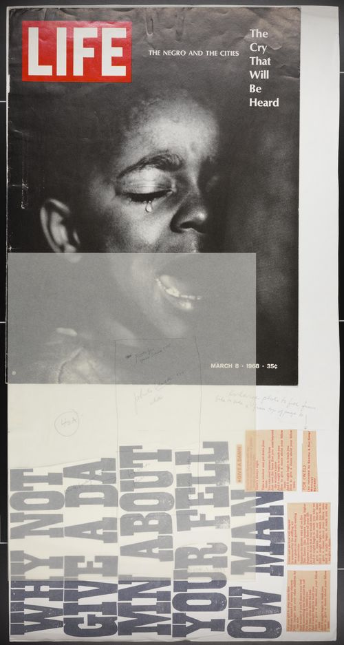
In many of these layouts, Corita uses a process of collage to bring together images and text from a variety of sources ranging from newspapers to tarot cards. Pasting these found elements together with her own designs, she created dynamic combinations of images and text that directly address viewers. Including detailed instructions to her printer in these untitled layouts, Corita ensured that her artistic vision would come to life in her completed screenprints.
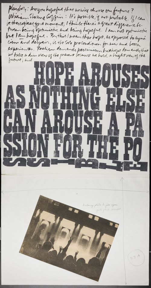
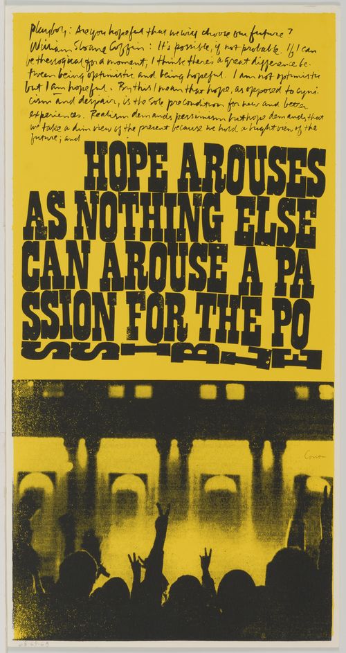
This layout and corresponding screenprint demonstrates Corita's ability to pull together material from her everyday experience and transform it through her artistic production. To make this screenprint, Corita transcribed text from a 1968 Playboy magazine interview with clergyman and peace activist William Sloane Coffin and enlarged the photograph at the bottom of the print to emphasize the silhouettes of outstretched arms giving the peace sign.
Works: Untitled, 1968; a passion for the possible, 1969
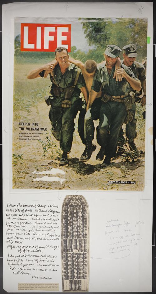
This layout and the resulting print demonstrate Corita's interest in engaging with the most pressing social issues of the day, as she juxtaposed two magazine covers addressing the Vietnam War with a diagram of a slave ship and a passage from Walt Whitman's poem "Song of Myself." Using extensive notations to instruct the printer to ultimately change the positioning of the layout's different collaged elements, the resulting print suggests Corita's ability to fluidly navigate her source materials.
Works: Untitled, 1968; news of the week, 1969
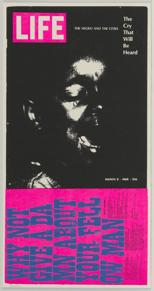
Exhibiting her passion for social justice, Corita turned her attention here to the racial tensions that pervaded the 1960s. Combining a powerful image from a Time magazine cover with song lyrics about racial inequality by the folk-rock group Spanky and Our Gang, she transforms the more somber material through fluorescent colors reminiscent of consumer advertising. Using vivid colors and bold graphics, the final print is arresting and confrontational.
Works: Untitled, 1968; the cry that will be heard, 1969
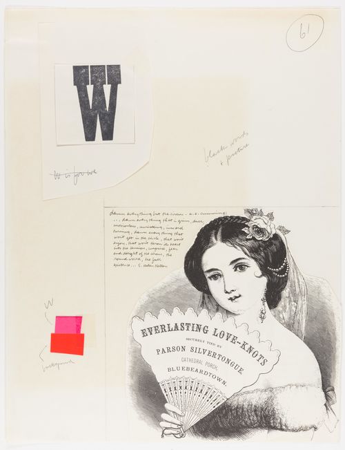
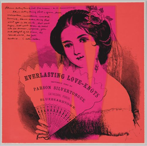
In this layout and print pairing, we can see Corita working out ideas as they relate to composition and content. In the initial layout, Corita wrote, "W is for we." Crossing this notation out, she maintained the single letter "W," which she enlarged in the finished print to overlay the entire image. Ultimately choosing the title w what every woman knows, Corita refocused the viewer's attention onto the figure of the woman from an advertisement for a type of jewelry called "Everlasting Love-Knots."
Works: Untitled, 1968; w what every woman knows, 1968
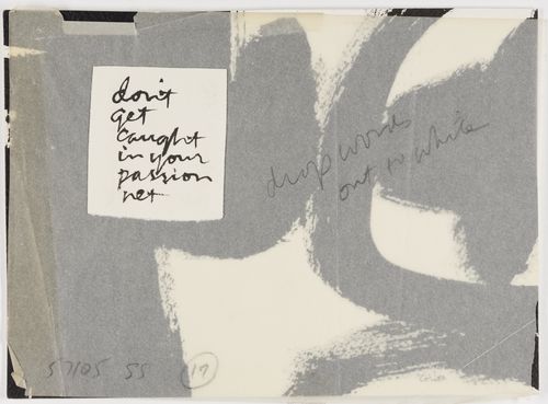
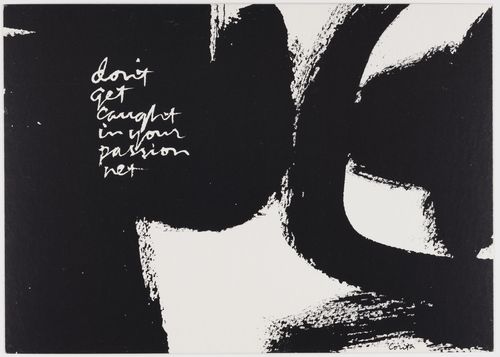
In her layouts, Corita often used tissue overlays, collage, and specific notations to her printer to ensure that she achieved her artistic vision. This specific layout is for a series of postcards she produced called High Cards, which feature abstract compositions and inspirational phrases.
Works: Untitled, 1974; high cards, 1974
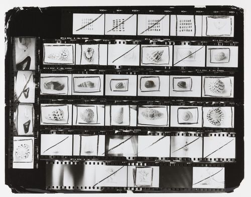
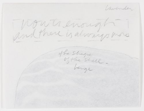
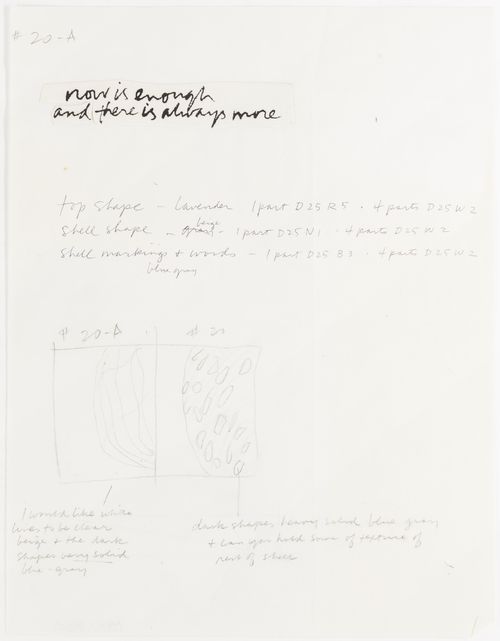
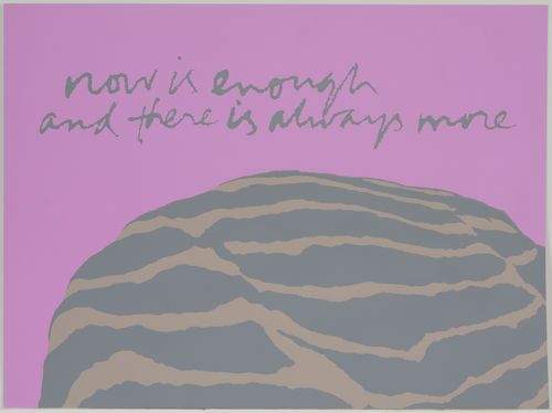
This contact sheet created in preparation for her shell writing series demonstrates how Corita used her own photography to create images, which she would then enlarge, crop, or otherwise manipulate in her screenprints. In this image, we see that the final screenprint is not just a direct translation of her photograph. Instead, Corita outlines the pattern on the shell's surface to emphasize the naturally occurring abstract form.
Works: Untitled, 1976; Untitled, 1976; Untitled, 1976; now is enough - shell writing #8, 1976
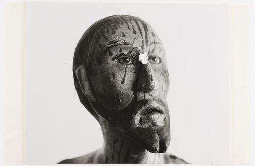
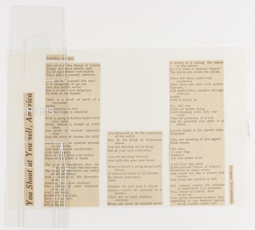
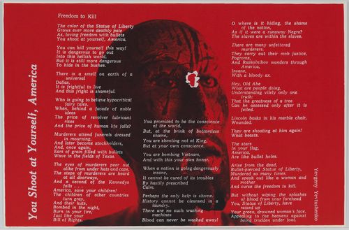
After taking a photograph of a statue from the Immaculate Heart College's folk art collection, Corita tore a hole into the center of the figure's forehead. She then combined this torn photograph with a poem by the Russian poet Yevgeny Yevtushenko that she cut out and collaged onto a separate piece of paper. She frequently engaged in such layerings of materials from a variety of different sources in composing her silkscreens.
Works: Untitled, 1968; Untitled, 1968; you shoot at yourself, america, 1968
In this layout, Corita gives detailed instructions to the printers at Hambly Studios. By including references to earlier screenprints that they had worked on together as well as noting specific proportions for mixing colors, Corita ensured that every detail of the work met her rigorous specifications.
Works: Untitled, 1971; for the oaks, 1971
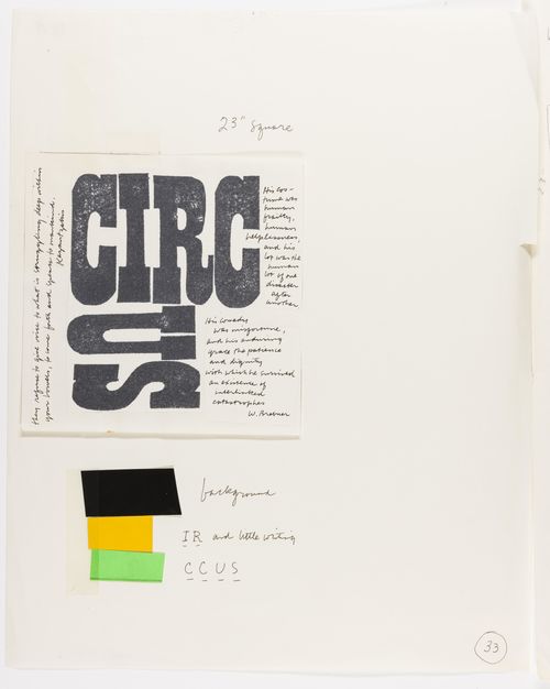
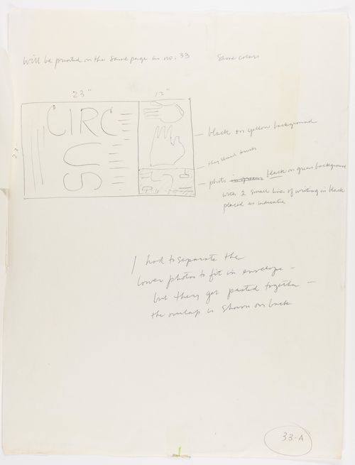
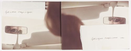
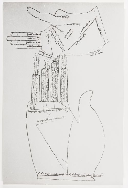
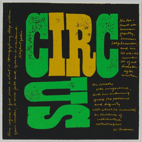
Through these layouts and preparatory materials, we can see that Corita conceived of circus and green fingers as being printed on the same sheet of paper. Often grouping works that employ the same colors, Corita's layouts reveal that she worked on several different series simultaneously.
Works: Untitled, 1969; Untitled, 1969; Untitled, 1969; Untitled, 1968; circus, 1968; green fingers, 1969
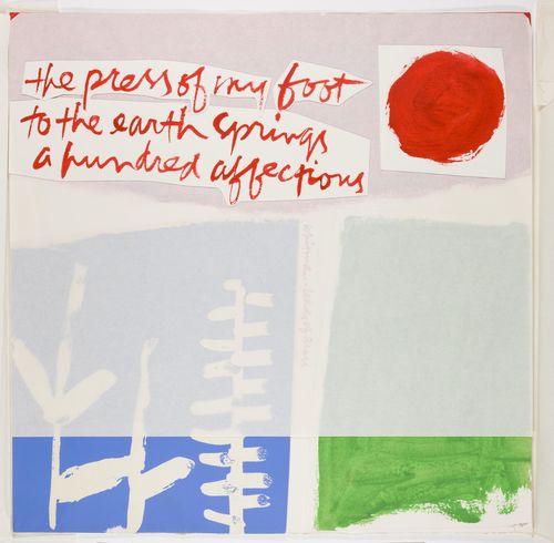
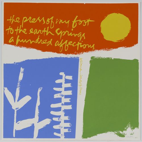
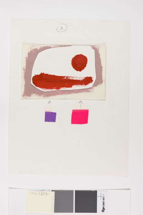
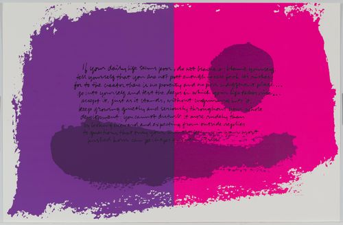
In this layout, we can see Corita layering materials to mimic the palimpsest that will occur in the screenprinting process. While the print was likely executed with the abstract landscape forms first, Corita put her watercolor landscape on the top layer of the layout to suggest that its placement within the larger composition is of central importance.
Works: Untitled, 1973; if your daily life, 1973
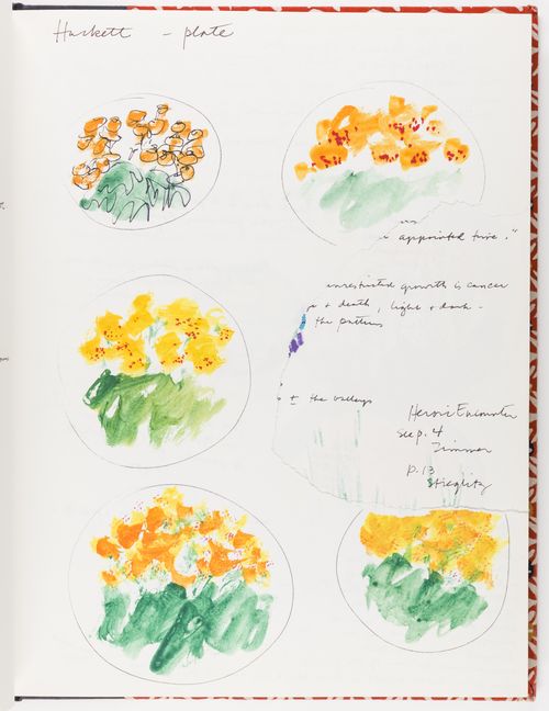
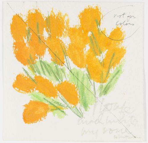
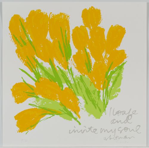
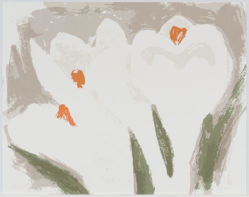
crocuses for summer and its accompanying preparatory materials demonstrate Corita's careful attention to detail and interest in seriality. Experimenting with a variety of compositions in her sketchbook, Corita continued to adjust her works until they met her exacting standards; she specified in her watercolor sketch that the flowers' colors would need to be changed for the final print.
Works: Untitled, 1970–1986; Untitled, 1980; crocuses for summer, 1980
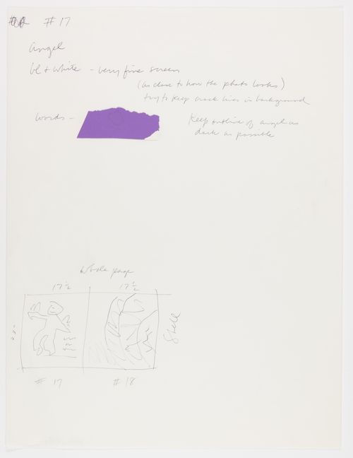
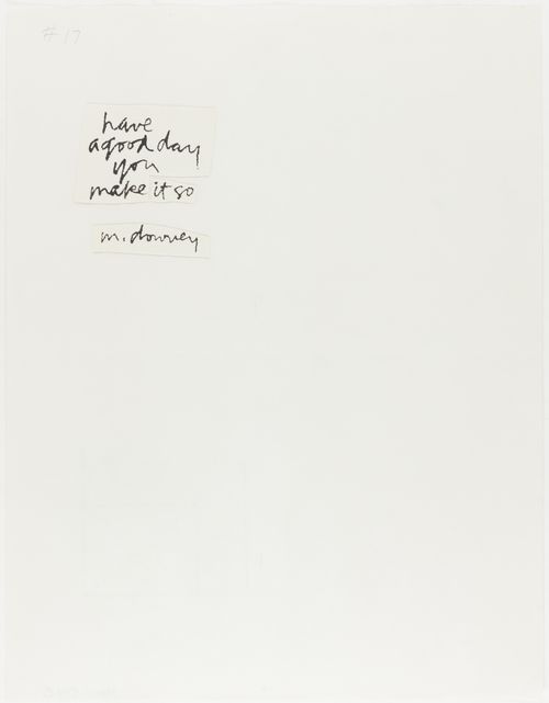
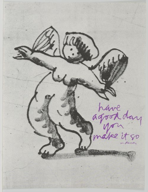
Corita's notes on her preliminary sketch to Hambly, stressing the importance of using a very fine screen to faithfully reproduce the image of an angel and capture the faint lines in the background, highlight her experience with and technical knowledge of screenprinting.
Works: Untitled, 1976; Untitled, 1976; delft angel, 1976
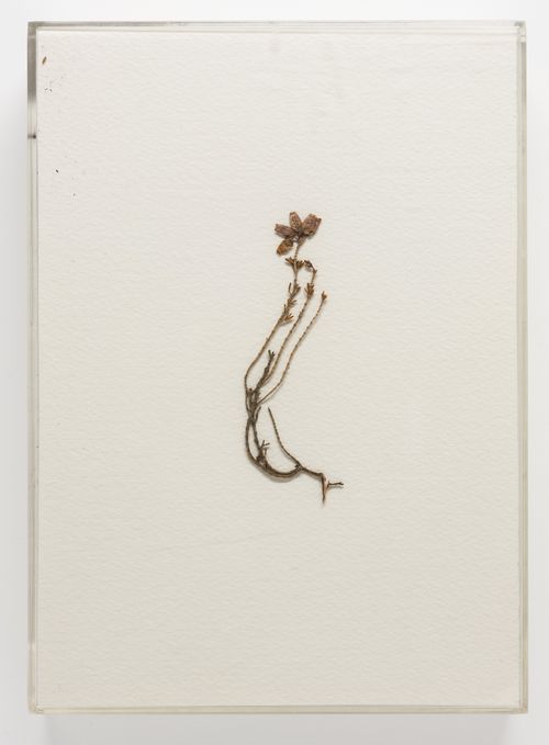
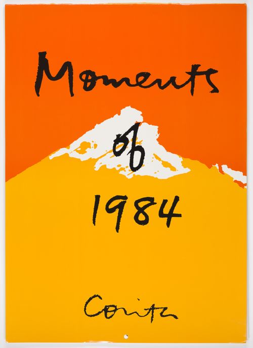
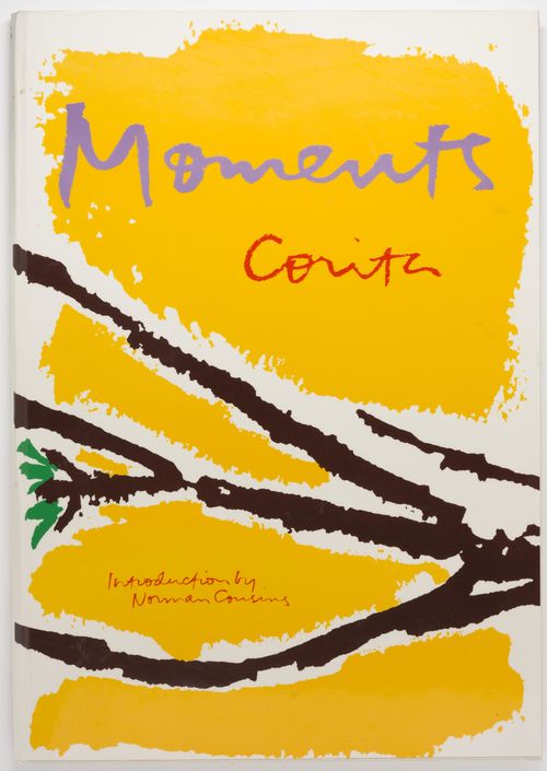
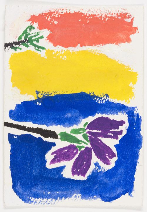
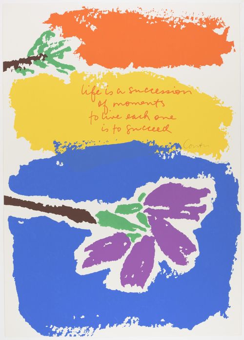
Corita saved not only the preliminary watercolor sketches for her Moments series, but also the dried flower that served as its inspiration. Corita also produced a calendar and both hard- and softcover books (which are also in the Hammer's collection) from the material for this series.
Works: Untitled, 1977; Moments, 1982; Moments, 1982, Untitled, 1977; life is a succession, 1977
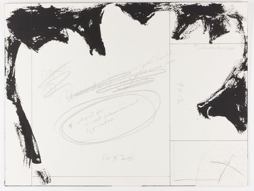
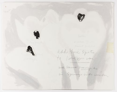
In the layout and preparatory materials for i love you very '81, Corita provided dimensions for her printer to follow in the composition of each section of the final print. Interested in maintaining some level of continuity throughout her artistic production during this period, Corita also instructed her printer to use the same color palette in this print that she used in another work, titled spring from winter (1981). At various stages of her career, Corita not only used similar color palettes but also returned to phrases that she found particularly moving. "I love you very" is a particularly popular phrasing that appears in many of her layouts from 1970 to 1983.
Works: Untitled, 1981; Untitled, 1981; i love you very '81, 1981
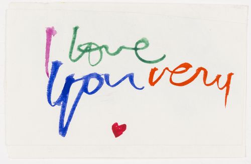
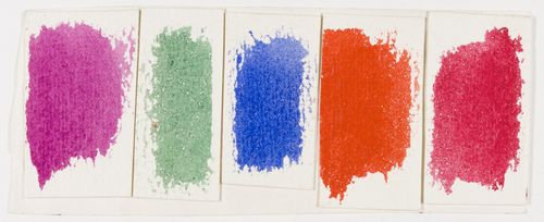
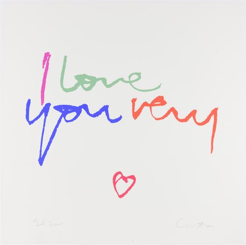
This watercolor sketch and color selections for i love you very '80 exemplify the care Corita took in designing her prints. While the sketch and the final print appear identical at first glance, closer inspection reveals that she made several deliberate changes in the final print, including transforming the heart to a simple outline. These seemingly minor changes ultimately create the bold composition that we see in the completed work.
Works: Untitled, 1980; Untitled, 1980; i love you very '80, 1980
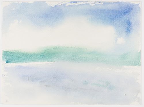
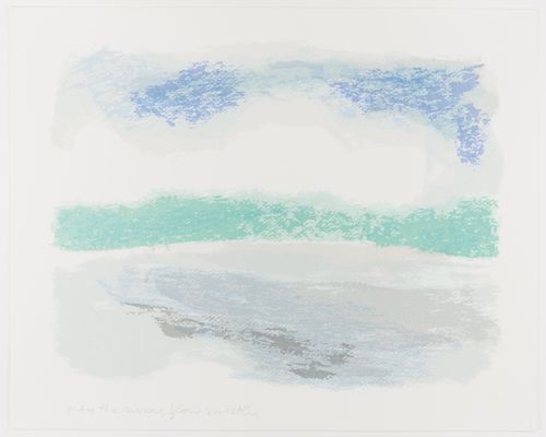
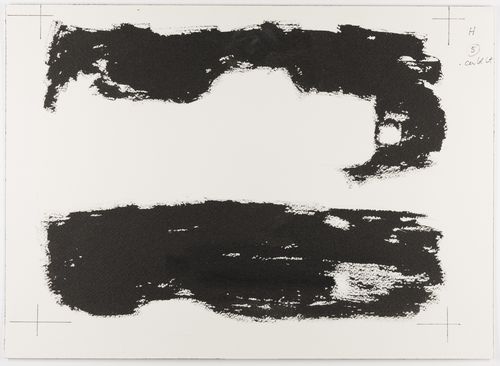
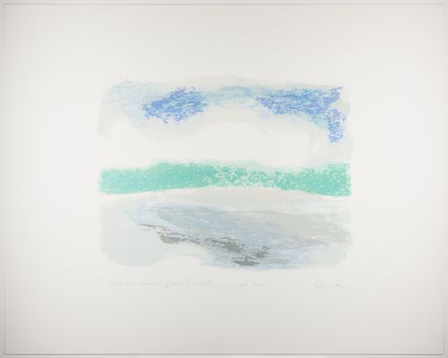
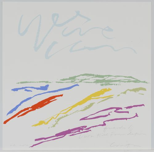
Toward the end of her career, Corita became increasingly interested in landscape imagery. This selection of watercolor drawings, layouts, and proofs demonstrates the evolution of her artistic process from initial watercolor to completed screenprint.
Works: Untitled, 1982; Untitled, 1982; Untitled, 1982; rivers, 1982
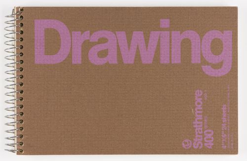
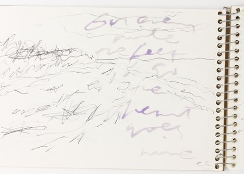
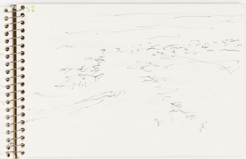
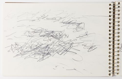
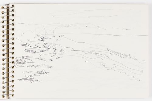
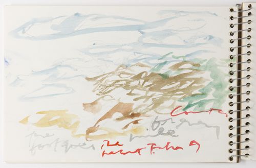
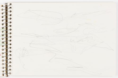
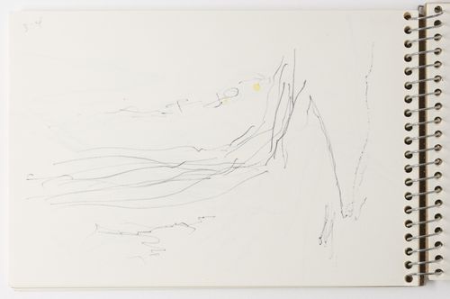
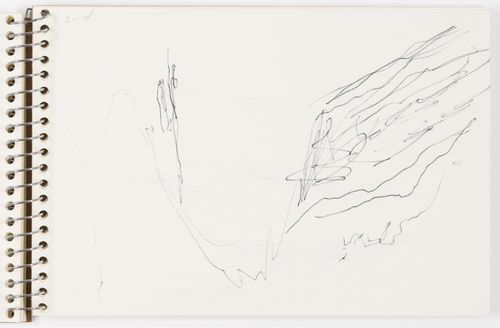
Throughout this sketchbook, Corita experimented with different landscape compositions. Filled primarily with pen-and-ink drawings, the sketchbook serves as an example of the iterative nature of her artistic process.
Works: Untitled, 1985 [selected pages]
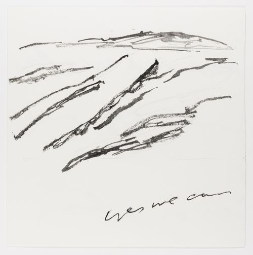
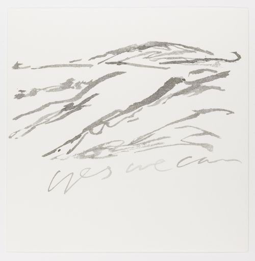
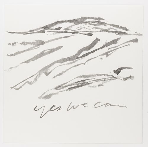
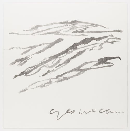
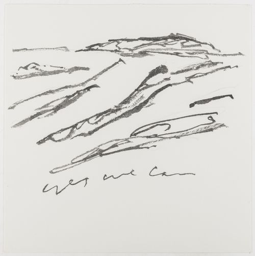
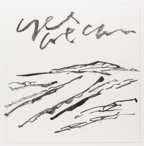
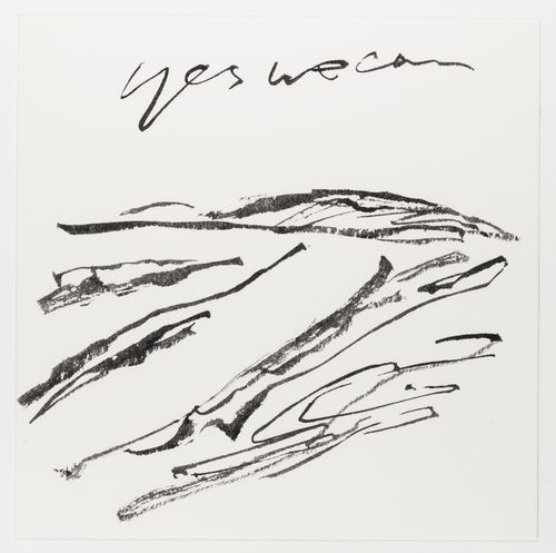
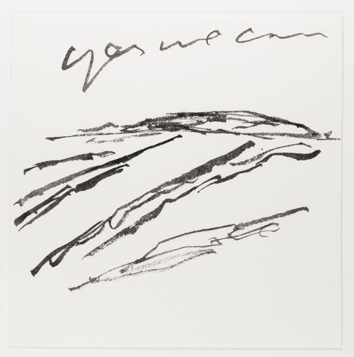
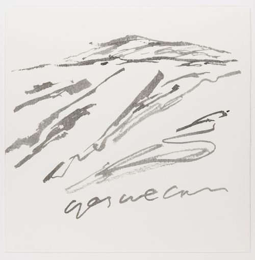
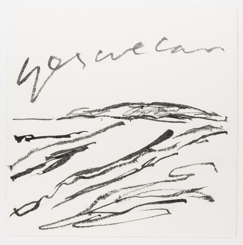
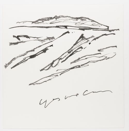
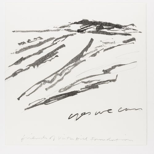
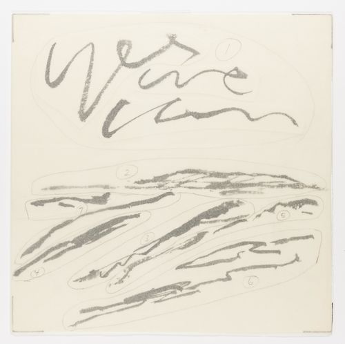
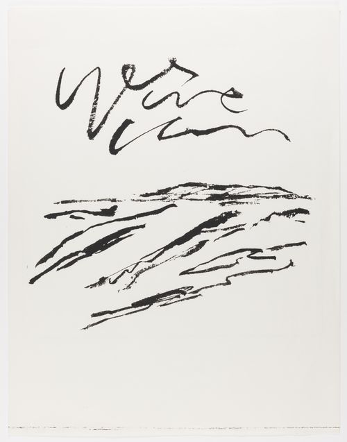
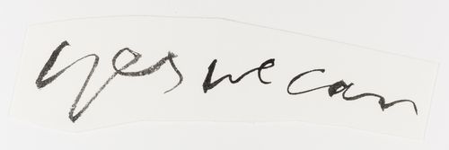
While Corita's screenprints are known for their bright, vibrant colors, she often used a monochrome palette to work out her ideas. In a series of watercolor sketches for yes we can, we can see her experimenting with a variety of text and landscape orientations in preparation for her final print.
Works: Untitled, 1986; Untitled, 1986; Untitled, 1986; Untitled, 1986; Untitled, 1986; Untitled, 1986; Untitled, 1986; Untitled, 1986; Untitled, 1986; Untitled, 1986; Untitled, 1986; Untitled, 1986; Untitled, 1986; Untitled, 1986; Untitled, 1986; yes we can, 1986
"Corita Kent on the 'Cooking' Period of her Creative Process," Museum of Contemporary Art, Cleveland, http://www.mocacleveland.org/media/artcasts/corita-kent-cooking-period-her-creativie-process
