
Power Up, Reassembled
This essay originally appeared in the brochure for the 2000 exhibition Power Up: Sister Corita and Donald Moffett, Interlocking at the Hammer Museum.
To download the original brochure, click on the Save PDF button at the top of this page.
Power Up: Sister Corita and Donald Moffett, Interlocking is a three-way dialogue in the form of an exhibition. The version this brochure accompanies is expanded from the original exhibition which took place at the Wadsworth Athenaeum in Hartford, Connecticut in 1997. Sister Corita, later known as simply Corita, was a Catholic nun who lived and worked in Los Angeles for thirty years. She reached a wide audience with her popular silkscreen prints and engaging style of expressing her views on faith, art, and society. Donald Moffett is a New York City–based artist who emerged in the context of the AIDS crisis. As an activist artist and designer, Moffett has broadly contributed to the gay liberation and AIDS-activist movements. Moffett works in a variety of media and uses various modes of distribution in order to engage diverse audiences. My background as an artist has essentially been in collaborative processes of exhibition-making engaged with interrelationships between culture and politics. My role in this project is organizing Power Up. I regard conceptualizing the exhibition's structure and designing its aesthetic atmosphere as an artistic practice, the exhibition as a medium.
Frances Elizabeth Kent was born in Iowa in 1918 to an Irish Catholic family who five years later moved to Los Angeles. Upon completing her Catholic education, Frances entered the Immaculate Heart of Mary Religious Community and took the name Sister Mary Corita. Between 1938 and 1968 Sister Corita lived and worked in the cloistered, communal environment of the Immaculate Heart Community.
In 1962, Pope John XXIII's Vatican II decree on the "Adaptation and Renewal of Religious Life" called for movement toward modern values, including fewer restrictions on nuns' daily lives, and a new focusing on social action and service. The IHC, like many Catholic institutions, was thrown into conflict over how previously accepted traditions were to be revised in practice. The nuns largely favored a progressive reading of Vatican II. Dramatic conflicts—amply covered in the media—ensued between the nuns and the relatively conservative, local archdiocese over the decree's interpretation. By 1969 the conflict resulted in an ultimatum from Archbishop James McIntyre to the community: either conform to his authority or seek dispensation from vows. By 1970, the IHC members had chosen the second option and formed an independent entity which exists to this day. They retained their name and structure of the organization, but removed themselves from Catholic Church supervision.
The Immaculate Heart Community had become (in)famous for its liberal orientation during the 1960s, as had the IHC College's Art Department for its progressive creative environment. Corita's celebrity seemed to run on a parallel track. In her art, and in her capacity as teacher and chair of the College's Art Department from 1964 to 1968, she embodied the modern nun.
For Corita, wide distribution was a populist and Christian principle that determined her choice of artistic medium. She learned serigraphy in 1951 and regarded printmaking as "a very democratic form, since it enables me to produce a quantity of original art for those who cannot afford to purchase high-priced art." Although she was committed to making her work accessible, Corita did not define accessibility based on an imagined lowest common level of visual literacy. Rather, the forms she utilized—serigraphs, greeting cards, publications, posters—and the venues through which she disseminated her work—churches, community centers, galleries, fairs, and corporations—made her art accessible to a broad range of viewers.
Corita introduced words into her pictures around 1954 and gradually increased their usage and scale until word became image. This inclination can be linked to a growing interest in her immediate urban environment and its signage systems. Although one does not usually associate the religious principles of the Catholic Church with supermarkets and the signage environment of city streets, for Corita such vernacular culture was a source of inspiration and raw material. Beginning in 1962, Corita quoted advertising slogans and mimicked package design motifs. She appropriated the colors of the marketplace and the aesthetics of promotional culture to ground her religious and political messages in contemporary urban life. Corita's cultural references and her palette and pictorial treatment increasingly became more pop. By 1964 her iconography was derived predominantly from urban surroundings and the new booming media environment. In an essay from 1968 titled "art and beauty in the life of the sister," Corita portrayed that period: "Our time is a time of erasing the lines that divided things neatly. Today we find all the superlatives and the infinite fulfillment man hungers for portrayed not only in fairy stories or poems but also in billboards and magazine ads and TV commercials. We are doing an age-old thing in new media. But when we learn (or teach) how to take fairy stories and myths and parables we must also learn (or teach) how to take billboards and magazine ads and TV commercials. In a sense this is simply to take signs as signs. Thank God for city scapes—they have signs. Thank God for magazines—they have ads. This sign language is infinitely rich."
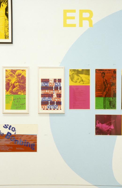
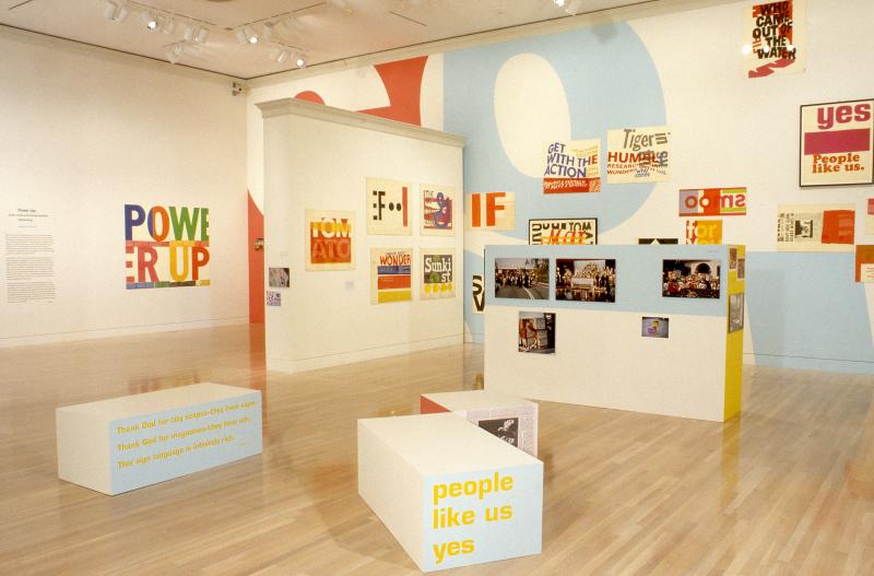
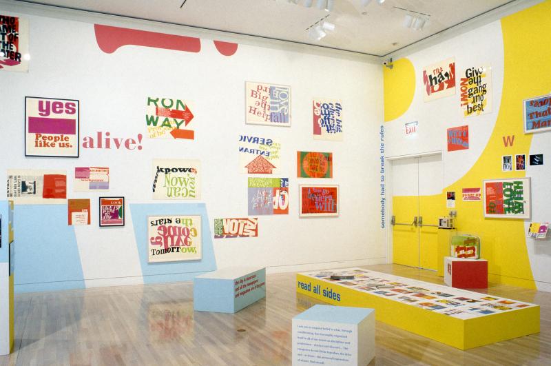
Between 1965 and 1969 Corita's work composes pictorial space as a forum in which a carefully orchestrated dialogue between voices is typographically expressed. The work quotes, combines, extracts, highlights, and layers elements from a wide array of cultural sources including advertising slogans, street and grocery store signage, poetry, scripture, newspapers and magazines, theological criticism, and song lyrics. Although authority is conferred on certain kinds of speech that are readily preserved in public records and historical archives, vernacular speech such as ad phraseology arrives and disappears from circulation swiftly. Corita's work does not reproduce the hierarchies common to such categorizing systems of information. In Corita's art, the fugitive elements of ephemeral culture are given permanence. Many rules of legibility central to the formalism of modernist design principles are broken in Corita's 1960s work. Language is excerpted, disassembled, reassembled, recontextualized. Typography is distorted, turned upside down, and faced backwards. Letter forms are ungrounded, float, and interlock.
In the culture of protest which typified the late 1960s, posters and graphic materials were important tools which carried information and galvanized people. Declaring in 1967: "I admire people who march. I admire people who go to jail. I don’t have the guts to do that. So I do what I can," Corita turned her attention to racism and poverty, U.S. military brutalities in Vietnam, and the conflicts between radical and conservative positions in the Catholic Church. Corita's prints made between 1967 and 1969 juxtapose nearly-fluorescent colors to elicit dynamic effects. They have a visual affinity with both political graphics and psychedelic concert posters from the time. Compositions are formed by dense layering of textual fragments and pictorial documentary material, resulting in compelling statements about the then-current political landscape. These visual dialogues are emblematic of the debate over social and political issues which defined the time.
From the late 1950s through 1968 Corita upheld a strenuous teaching, lecturing, and exhibiting schedule which allowed only a two-week summer vacation annually, during which—with a burst of energy and assistance from fellow nuns and students—she made her prints. Despite what seemed to be her avid participation in public life, by 1968 she was seriously fatigued. Beleaguered as well by frequent censure from the archdiocese, Corita decided to leave the order and move to Boston to pursue a less restricted personal life and concentrate on her art. Deprived of her influential contexts of many years, the critical force and formal innovation of Corita's prior work vanished. Her art work grew more sentimental and increasingly reliant on platitudes and color splashes. Nevertheless, she remained a popular artist. Distribution to broad audiences continued to be important and Corita accepted many corporate commissions. In 1985 the U.S. Postal Authority published her "Love" stamp in an edition of 700 million. Corita died the year after.
Corita Kent's work featured in Power Up proposes a symbolic template for blurring the boundaries between art and design, aesthetics and politics, and for decentralizing authority—be it monolithic or monologic—within the larger context of then-current struggles over restructuring society.
Conceptually driven, Moffett's work in Power Up primarily employs montaged photographic images. He has also worked with light boxes, painting, large print runs of cards and posters, and sculpture. There is a free-flow between each of Moffett's differentiated ways of working, with the artist moving from gallery to street with uncanny dexterity.
In the framework of the 1991 congressional debates over the efficacy of the National Endowment for the Arts, Moffett explained his perspective at a hearing on Government Operations to the U.S. House of Representatives:
"I ask you to suspend belief in what, through conditioning, has thoroughly organized itself in all of our minds as disciplines and professions—distinct and discreet. . . . The categories do not fit the impulses, the drive and—at times—the personal imperatives of where I find myself and where Bureau has found itself. What we do mixes design, photography, performance, writing, painting, sculpture, film, and video. We also mix our individual practices with our collective practice. But an equal and dangerous part of the mix is the larger episodic social narrative that educates an artist's choices—like, in my case, growing up gay in Texas with its chaotic intrusion on the psyche and the family, not to mention its political and legislative consequences. On a larger stage, there is the AIDS catastrophe with its social, economic, personal, and historical consequences."
Moffett's artistic practice is informed by intent for display and distribution both in and beyond the parameters of the art world. He sometimes recycles images and slogans, recasting them into different forms and thereby changing their content by activating a specific context or mode of distribution. For instance, the piece titled "You and your kind are not wanted here" was made in 1989 as a set of eight circular light boxes. When confronted with the piece in a gallery space, viewers are made to consider what type of bias might elicit such a powerful sentiment. Viewers are made aware of their own group identifications and markers—i.e., class, gender, race, sexual orientation—as well as of the place they are standing in. The same slogan was retrieved several years later in 1994 for re-use as the central element of a large-scale street poster designed by Bureau for the American Civil Liberties Union's campaign for gay and lesbian rights. The slogan acquired specificity in this context. The ACLU poster delivered a particular message and functioned as propaganda or public service. The meaning of the sculptural piece when presented in a traditional art setting is open-ended and enlists viewers to make its meaning according to their own associations and allegiances. Moffett is committed to both ways of working. He rhetorically inquired at the same hearing quoted above: "Can you imagine Senator Helms' temperature every time he sees art in the streets, art on billboards, art on the bus stops and on the sides of buses? Art in newspapers and magazines? He sizzles because it proves art is exactly what he knows it to be: powerful and sophisticated beyond his wildest fears in its incessant forthright agendas of exploitation, liberation, and social justice."
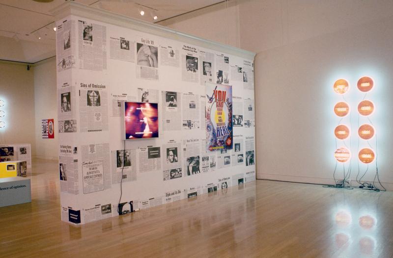
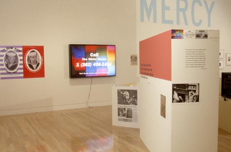
Between 1989 and 1992 Moffett made a series of images in the form of disarmingly simple photo-text montages for the "Age of AIDS" column in the Village Voice weekly newspaper published in New York. These pieces relied on metaphor and expressed commentary in visual shorthand form, often with complex implications. Generated on a tight weekly schedule, these artworks contributed to a specific discourse concerning AIDS in the column itself. But they also function as self-contained images whose meanings are more open-ended when isolated from the texts. These ephemeral pieces enabled Moffett to express his observations in a highly distinctive visual shorthand. In their original context, the "Age of AIDS" pieces were high-level art-as-propaganda. They are also sophisticated works in which metaphor is utilized for political effect. The Village Voice is on newsstands for one week, and then is only accessible in archives. For Power Up these pieces are digitized and reprinted as Iris prints to retrieve and stabilize the works for new contexts. They are featured in the exhibition along with several of Moffett's sculptures and ephemera from the same period.
The video store, picture archives, and our vernacular visual culture are fertile sources for the phrases and images of Moffett's recombinant practice. For the "Age of AIDS" pieces he mined these repositories in search of ground imagery in relation to which he placed the text, often needing only one word or at most a phrase. Moffett's image and text style of pairing and his staccato commentary methods share the pace and drive of contemporary advertising. His phraseology often cuts to the quick. Determined by his agenda, communication is as ambiguous or precise as he desires.
Moffett's work in Power Up was made between 1987 and 1992, a period in which the contested arena of representation was an important subject in contemporary art and its related discourses. These works are chiefly concerned with public morality as interpreted and legislated by conservative religious and political institutions. Alert to the subtle control apparatuses that are used to impose and enforce such morality, his works succinctly articulate those configurations of power, at times with wicked humor. Many of Moffett's works address issues of sexuality and desire. They have functioned as touch points for subjective and collective identification and confirmation in and around political conflicts.
When interviewed by Holland Cotter for the June 1994 issue of Art in America, Moffett was asked if he believed that art could change society. He replied: "European history would demand an easy yes. But now? I'm not so sure. Art seems more and more like an anxious little peep next to the roar and glamour of commercial film and TV (and their obvious ability to change society). The real question for me is whether or not art can simply participate (or be allowed to participate) in the process of social change. Will art and the industries that clamor about it reinvent its integrative link to a larger community, i.e. the world? Let's hope, it's kind of stuffy in here." Moffett often turns up the volume in his work, not simply to compete with the roar of media, but to amplify his own position vis-à-vis significant and affecting socio-personal and political issues.
Donald Moffett's methodological model proposes a strategy for dislodging the boundaries between artistic mediums, and between art and design. Whether in traditional art venues, in the mass media, or in the street, Moffett's work articulates and advocates art's integrative link to larger social narratives.
Power Up juxtaposes these two artists who are not readily united either historically or formally. They are paired for their overlapping methods and parallel convictions, as well as for their distinctive subjectivities. Both Moffett and Corita commandeer graphic design as strategy for social commentary. Both share a laissez-faire approach to vernacular terrain as source. They have each used the distribution frameworks of mass media to reach broad audiences. Through using multiple mediums and traversing limits that demarcate the art world and the world outside, both artists have changed the elitist structure of fine art and its system of circulation. As the third artist in this project, I likewise engage design and politics via exhibition-making, and share Corita's and Moffett's points of contact in my practice.
Of equal interest are the distinct visual vocabularies Sister Corita and Donald Moffett developed in their personally and politically engaged aesthetic practices. Power Up configures their works to emphasize the differences: Corita's work features decentralized compositions; Moffett's work uses linear compositions. Corita's artistic voice is friendly and playful: "Mary does laugh; and she sings and runs and wears bright orange. Today she'd probably do her shopping at the Market Basket." while Moffett's is oftentimes confrontational and fiercely ironic: "I spoke with your God. He commands me to cut out your mouth."
Juxtaposition, graphic design, and contextualization are key strategies in both Sister Corita's and Donald Moffett's works in Power Up. These strategies also convey principles of a practice that set the stage for and determine the many particulars of this exhibition and how it looks. Power Up's exhibition design derives from the aesthetic features of Corita's and Moffett's artworks. Both have used cut-and-paste techniques to make new and unified wholes and to communicate visually. Power Up has been shaped correspondingly. Cut-and-paste methods involve taking something out of one context and through recasting, producing another. In Power Up a specific context is constructed. The intended effect is that upon entering the exhibition the viewer crosses a threshold into a dynamic visual and contextual environment. Ephemeral materials gathered during my research which informed and deepened my understanding of the artists, their works, and the periods the works were made in are integrated into the display. Power Up: Sister Corita and Donald Moffett, Interlocking challenges any clear-cut notion of separation between objects, exhibitions, and the outside world and is intended to deepen the rich legacy and interplay of art, design, history, politics, and social relevance.
This essay originally appeared in the brochure for the 2000 exhibition Power Up: Sister Corita and Donald Moffett, Interlocking at the Hammer Museum.