"Have You Been Hacked?" The Artist Behind the M&M's Responds
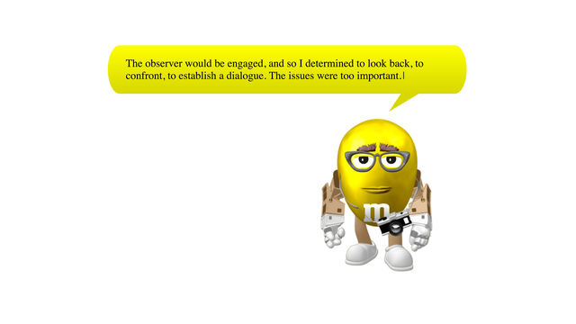
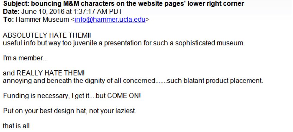
"I don’t want to eat M&M's anymore," said one of my new colleagues on my first or second day in the office—I don’t quite remember. A few other coworkers chimed in, and this comment evolved into a larger conversation. Why so much distaste toward one of my favorite candies? If you are reading this, then that means you might have a guess why. Yes, it’s because of the little friend in the lower right corner of your screen right there. Yes, that M&M trying to get your attention. If you have been frustrated, annoyed, or confused by these characters, rest assured you are not alone. There are many people out there with similar sentiments toward Guthrie Lonergan’s Built with Indexhibit, part of Made in L.A. 2016: a, the, though, only. Below are just some of the responses we’ve been getting about the M&M's—almost one a day.
Following the responses, we interviewed Guthrie Lonergan to learn more about the work—and to find out how he feels about your reactions to it. Jump down to the interview.
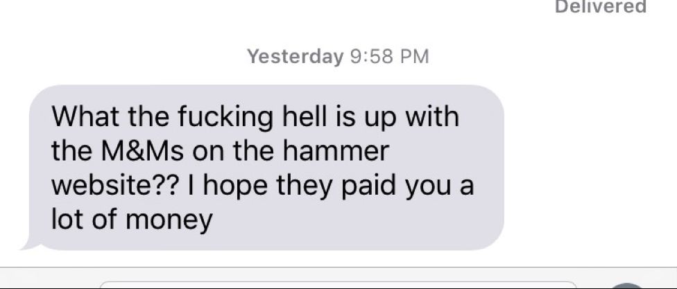
Response type 1: Are you guys hacked? Or am I?


Response type 2: Is this an ad?

And of course, there are people who appreciate or intrigued by the little guys.
Response type 3: I think I like them
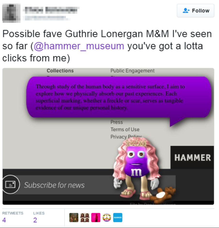
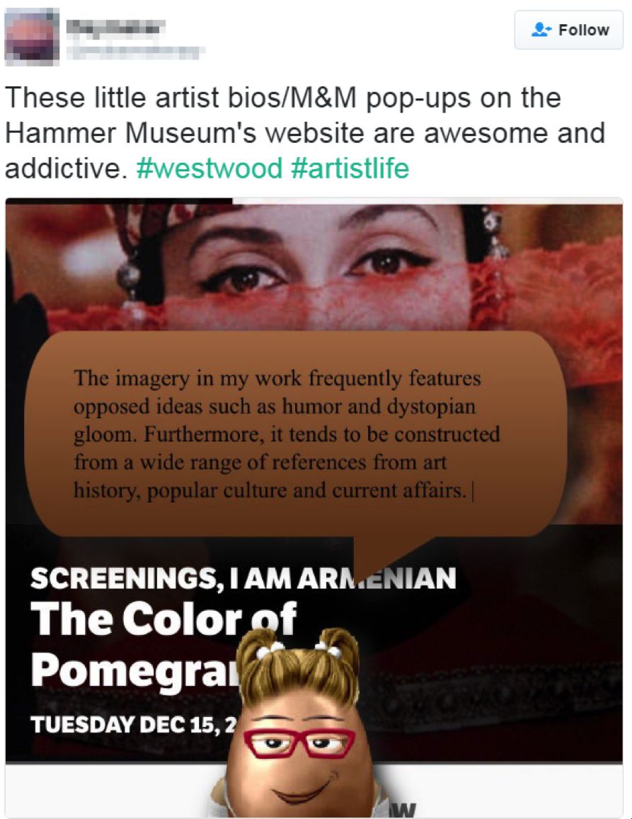
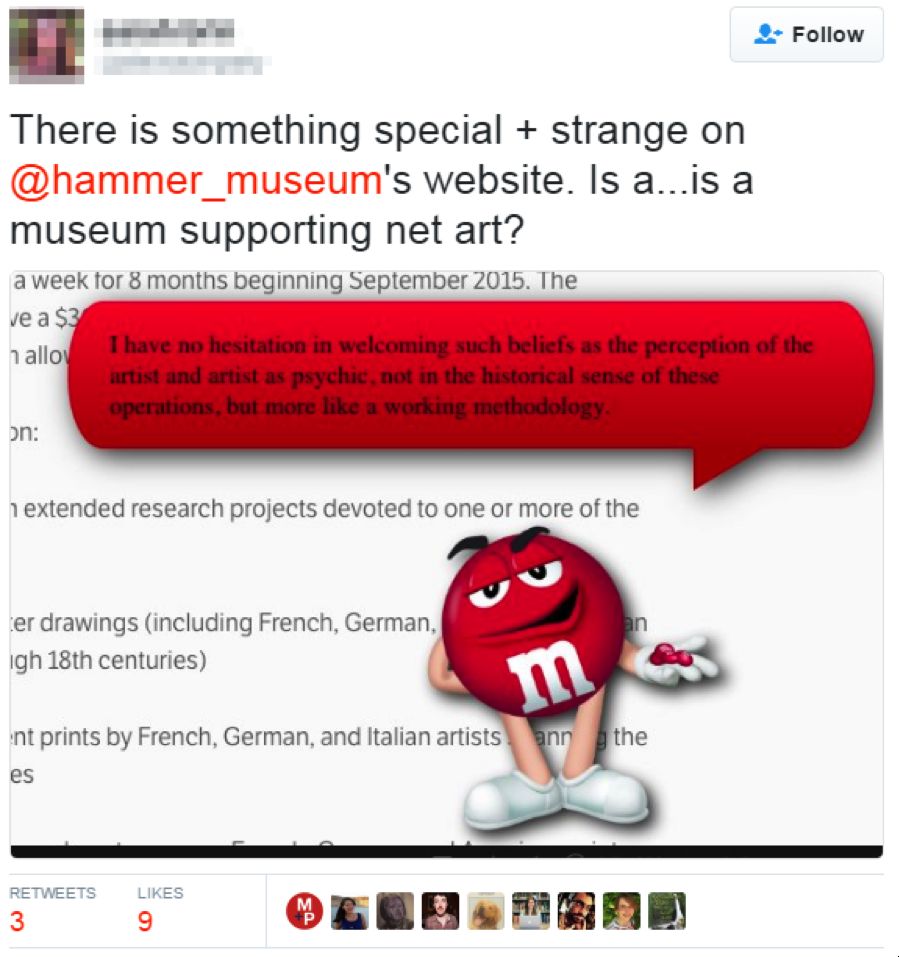
As you can see, many people have responded to Guthrie’s work on various platforms. For that reason, we even generated a blanket response for the emails:
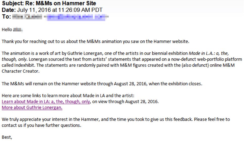
The Artist Responds
But for those who are not satisfied with just an automated response above (and I am one of them), we reached out to Guthrie for some answers to these unanswered questions.
Jane: Why did you choose M&M's as your subject?
Guthrie: M&M's were the perfect complement to the found artists' statements, the blurbs in the speech bubbles which are the main focus of the piece. I needed a wide spectrum of artist avatars, and each random pairing of text and M&M creates a strong artistic identity and personality. It helps that they vaguely resemble Microsoft Word's infamous Clippy, the inspiration for the piece's presentation, and that M&M's cultural pervasiveness makes them almost invisible in most contexts. Some of them are fan-made M&M's created using an avatar-builder formerly available on the M&M's website.
Also, I kept imagining the M&M ad meeting: "Let's just stick eyes and legs on the product and make it talk."
I’ve noticed that every M&M has a different blurb. Where are the blurbs coming from?
The blurbs are pulled from about 1000 found artists' statements. I wrote a script which automatically mined the web for artists' portfolio websites which were built using the once ubiquitous platform Indexhibit*. Using these, my piece automatically pulls random sentences from random artists' statements and pairs them with random M&M's. There are countless possible permutations.
(*See my essay in the Made in L.A. 2016 catalogue for more on Indexhibit.)
There is no explanation of the M&M's on the Hammer’s website. Why was this decision made?
I wanted the piece to sneak into viewers' everyday browsing experiences and confuse them a little, rather than have some obvious demarcation, like a button that says, "click here for the artwork experience to begin." It's a museum website intervention—many, many visitors come to an institution's website seeking information and documentation, and I love the idea of all these artists' statements, culled from different places all over the web, just barging in on that.
We have been asked many times by our website visitors if the M&M's were advertisements, or if our site was hacked. Many of the responses we’ve been getting are of anger and confusion. Was this the response you were anticipating, and if not, how are you reacting to the feedback?
I definitely wanted to raise a few eyebrows. I wanted the piece's placement to feel somewhat natural to a website visitor so that it wouldn't immediately read as "art" (we're accustomed to having some text/cartoon down in the corner of a window attempting to help us), but I also wanted something about it to be a little too fishy to seem "real"—because it makes zero sense that something like this would be slapped on any respectable museum's cleanly designed website. I didn't really expect anger, but I must admit that I find these reactions mostly funny. I'm really grateful and excited that the Hammer is supporting Internet-based art like this.
—
It’s been 6 weeks since Made in L.A. 2016 opened, and it certainly has been an entertaining 6 weeks witnessing these responses of various emotions. What was your response? Did you think you were hacked? Did you think that suddenly M&M’s became our sponsor? Share your response with us on Twitter!

