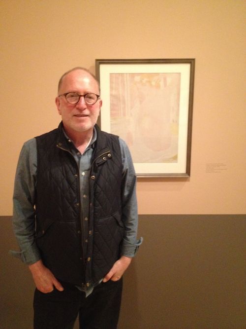
Shades of Tea and Morphine
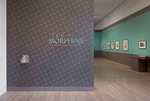
On the title wall, Tea and Morphine pops out in turquoise lettering from a patterned, sepia backdrop. The exhibition, co-curated by Cynthia Burlingham and Victoria Dailey, highlights prints from the Elizabeth Dean Collection depicting women from all social strata in Paris in the late 19th and early 20th centuries. As the title suggests, the scope of the exhibition is framed by two extremes––the morphine addict, pressing a syringe into her thigh, captured in Eugène Grasset’s color lithograph Morphinomane (1897) and the sophisticated young woman staring off vacantly while at tea, observed in Mary Cassatt’s drypoint Tea (1890). The choice of wallpaper print subtly introduces this dichotomy of the sordid and the socially acceptable. While the use of wallpaper itself evokes a domestic setting, its Art Nouveau pattern of poppies alludes to opiates. Not by coincidence the exhibition’s expert colorist Scott Flax singled out this fitting motif from a book of Eugène Grasset’s designs. His thorough research into the period similarly informed his selection of the wall colors for the exhibition, which progress from acidic bluish-green to light apricot to warm pink-orange (a deepening of the previous room) to sapphire. Over coffee, I spoke with Flax about his profession and his process. He describes his work as site-specific, in dialogue not only with the artworks and themes of the exhibition, but also with the architectural space of the galleries.

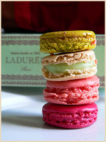
Given a pamphlet with images of all the artworks for Tea and Morphine and told the overarching themes—drugs, sensuality, arts and culture, and spirituality—Flax delved into art books and exhibition catalogs, as well as his own memory bank of museum visits and travel, for specific color references. To conjure the city of Paris as the setting for the exhibition, he pulled hues from the celebrated patisserie Ladurée. With colors reminiscent of the blue-green walls of the elegant Ladurée tea room and their boxes of orange blossom, raspberry and pistachio macarons, the exhibition conveys both the vibrancy and deliciousness of Paris.Yet the colors selected contain period references as well. The turquoise of the first room, in particular, calls to mind the verdigris of the curled Art Nouveau entrances to Paris Metro stations. Rather than restyle the era of Tea and Morphine in faded, pastel tones, Flax sought to revive it. He looked to the saturated interiors in works by Pierre Bonnard and Édouard Vuillard as a window into the period. Assembled from dabs of rich color, their paintings peek into the intimate settings of the home.
In an effort to “domesticate”the gallery space, Flax employed a form of architectural shorthand. He used paint to approximate wainscot and crown molding—a waist-high section of grayish-sepia along the bottom of the wall, together with a thick border of the same shade along the top. These alterations reduce the scale of the room to that of a residential salon. The border along the top of the walls, in particular, prevents the eye from drifting up to the bare white ceiling. Within this context, the display cases, painted the same sepia color to complement the the galleries’ hardwood floors, mimic wood furnishings. These touches contribute to the impression of a domestic space, likely the original viewing conditions of the artworks on display. As Burlingham and Dailey explained during a walkthrough of the exhibition, prints from this period were commonly collected in albums by cultured members of society. Collectors might, on occasion, single out individual prints to frame and hang on their walls. In either case, viewers would have admired these works within the context of the home.
For the exhibition, Flax settled on uniform off-white matting and a simple medium-thick frame profile for the prints. The gold and pewter frames shimmer against the multicolored walls of the exhibition. The careful arrangement of wall colors subtly reflects the shift in theme from room to room. Against the bright bluish green backdrop of the first room, the depictions of drug addiction and prostitution are particularly jarring. Although striking, the wall color has a lurid quality that fits the theme. The seemingly subdued pink shades of the middle rooms draw upon associations of bare skin and sensuality. These colors hint at the sexual allusions within many of the prints of urban women. The actresses, performers and shop girls that held such interest for the artists of the period often doubled as prostitutes. The stunning blue of the final room releases all ties to the body in favor of the ideal. Reminiscent of the night sky, the deep shade lends a serene, otherworldly beauty to the primarily black and white prints of idealized female figures—from a mother in the home to Beatrice from Dante’s Divine Comedy.
The curators selected this studied combination of wall colors from a series of color boards presented by Flax. For greater accuracy, Flax assembles his color boards from paint samples with defined formulas rather than from Pantone swatches. He deals primarily with available paint lines such as the English-based Farrow and Ball, from which he selected the aptly named “Arsenic” green and “Fowler Pink” for Tea and Morphine. For the other two paints, he collaborated with Cox Paint in Santa Monica to mix the perfect colors. The celestial blue of the final room was particularly elusive—its atmospheric quality demanding a fine balance between red and violet. The exact shade seems taken directly from one piece in particular, Odilon Redon’s La Sulamite (The Shulamite) from 1897. With a Biblical name that alternatively translates to “perfect one” or “peaceable one,” the serene figure emerges from a cloud of dark blue with her eyes downcast and her head bowed. For Flax, the ideal paint mixture accentuates the majesty of such an artwork without upstaging it.
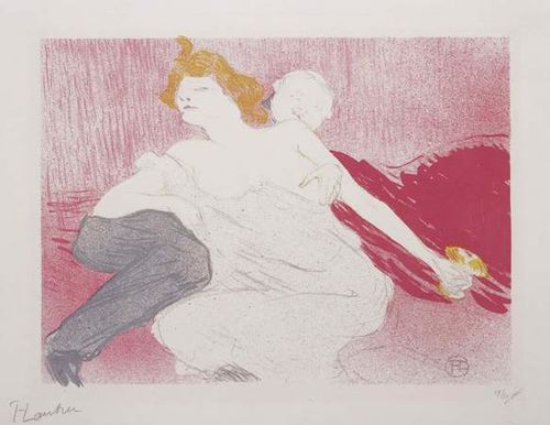
As a guiding principle, Flax bases his color choices not on personal preference, but rather on “how best to illuminate the art.” Although the final wall colors manage to suit all of the works in the exhibition, they particularly flatter certain pieces. In the first room, in addition to the eye-catching Grasset prints, the acidic turquoise of the walls offsets Toulouse Lautrec’s Débauché (The Debauche) from 1896. The color lithograph shows a man and woman lounging intertwined. The vivid wall color animates the golden orange of her hair and cocktail glass, as well as the cerise of the upholstery to her side. The soft pink wall color of the second room, in turn, gently complements and enhances the subdued beauty of Maurice Denis’ Nymphe Couronée de pâquerettes (Nymph Crowned with Daisies) of 1899. Its delicate heather-gray contours render a nude woman in a forest gracefully adjusting the string of daisies around her head. The shade of the walls enriches the pale pink of her skin and the sky peeking through the fence of trees in the background. Stark white walls would have undoubtedly washed out the idyllic scene. By drawing out nuances within the prints, the wall colors of the exhibition encourage viewers to engage more deeply with the art.
The wallpapered title wall at the entrance to Tea and Morphine acts as a signpost. Crossing the threshold into the exhibition, the visitor is transported to turn of the century Paris. Rather than distract the viewer, the vibrant wall colors sustain the illusion. Flax, thanks to his meticulous attention to detail, has selected hues that do not merely showcase the prints on display; they also reflect the historical context and underlying themes of the exhibition.
Many thanks to Scott Flax for sharing his expertise. Tea and Morphine: Women in Paris, 1880 to 1914 continues until Sunday, May 18th.


